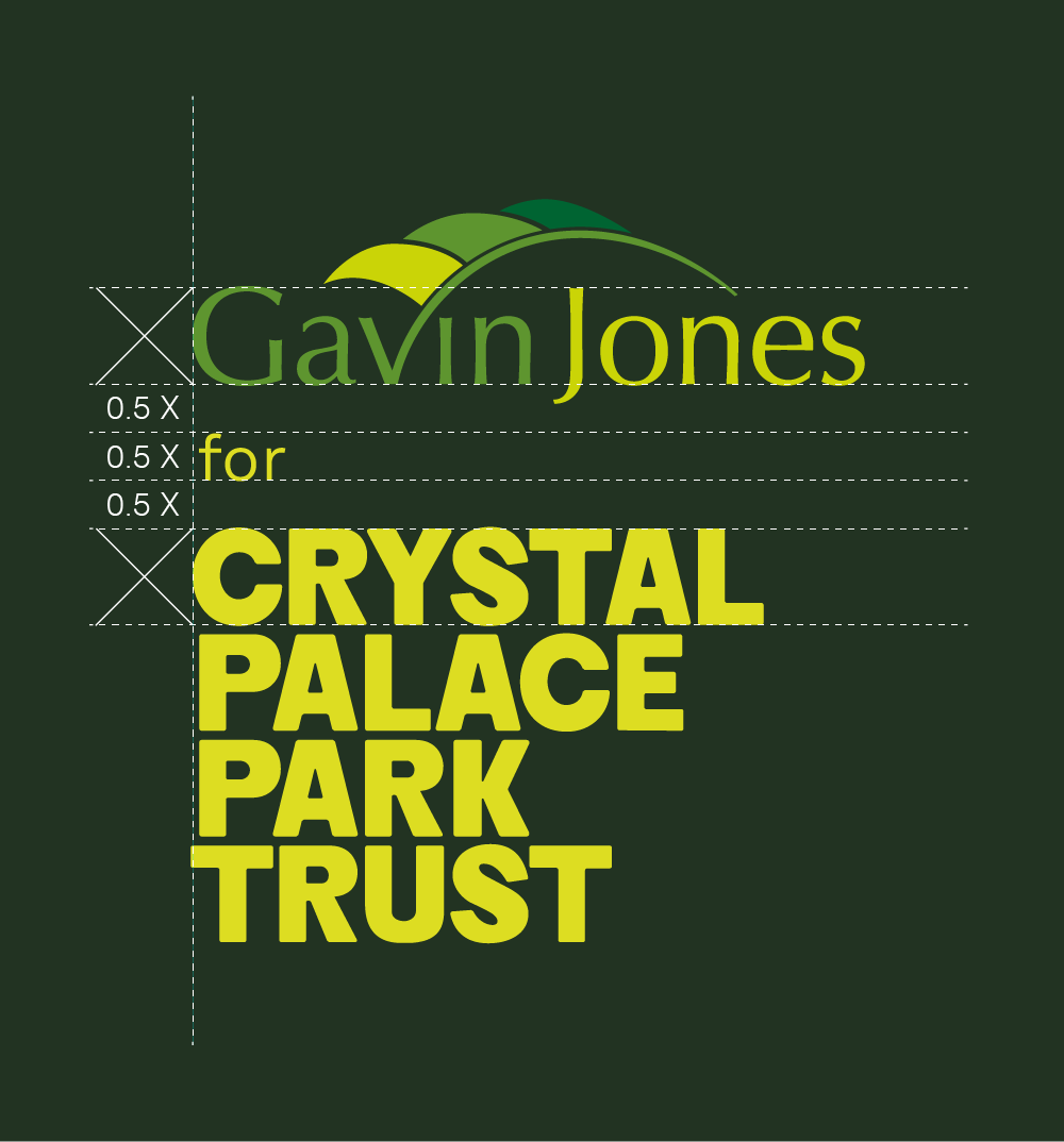
We need to express the nature of our business partnerships, so that our stakeholders recognise areas of shared responsibility and to give credit to those partners. This can be signposted at a high level by the manner in which our logos are used together. Clarity is the key.
Who does what?
For the community and other stakeholders, this is not always clear. To fairly credit and to jointly take responsibility it is important that we make the nature of our partnerships as clear as possible. Consider all the main points of contact between our partners and the general public – these often represent an opportunity to begin to explain who does what, which we can expand and develop over time.
Partnerships can be signalled at a high level through the combination of our logo with that of our partner, commonly known as a ‘lock up’. In many cases, this simple visual acknowledgement of our partnership may be all that is needed, but it is worth considering the following:
- within lock-ups a well-chosen linking word or words can help explain the relationship between the two organisations;
- consider the potential for each point of contact with the community as an opportunity to clarify the nature of partnerships, e.g. on the clothing of our partners, vehicles, or park utilities such as bins;
- occasionally, when space and context permits, a very concise, descriptive text of one or two sentences may help provide missing context (but use them consistently);
- consider whether a linking web page (e.g. referenced by a QR code), posts in social media, or a physical notice at the point where partners are performing duties on our behalf can help explain the need and benefits of our partnerships;
- with the above, clear links to relevant policy and other documentation can provide detail for those who wish to scrutinise further.
Generally speaking, our logo should appear first within our own communications, but should follow our partners’ logos in theirs.
Practical examples
With Gavin Jones, we have established a logo ‘lock up’ that can be used on clothing and elsewhere. Although partner logos vary considerably, the principles may broadly be applied to other similar partnerships.

For lock ups, it is important that one logotype does not overpower the other, either in terms of size, placement, or colour. Simpler versions of partner logotypes are usually preferable. An appropriate choice of colourways can help unite the logos.
Construction principles
As noted elsewhere, our name is ranged left within our logo, which creates a natural point of alignment when we create logo lock-ups. Note the that the initial letters of our logotype are visually aligned, rather than absolutely aligned. Consequently, in oder to look correct, you should align initial letters in partners’ logotypes with similar letters in ours, e.g. the curved letter “G” of “Gavin” with the curved “C” of ”Crystal“. With other partners whose name begins with a straight letter, we might align to the straight lines of the “P” of “Park”. Shapes within logos function in a similar manner. But please note that the creation of such lock ups is a job for a trained designer.

Obtaining an appropriate balance between the two logos is a matter of judgement, but it helps to have some simple correlation between them, in this case the cap height of the two names, which also provides the basis for the position of the linking word “for”. Linking words should be short and descriptive of the partner relationship, but prefer simpler, less formal terms like “for”, or “with” to more formal ones like “on behalf of”.
Exclusion zone
When our logo is used, it is important that it stands out clearly and legibly. The cap height of our name defines an appropriate “exclusion zone”, which is the area that should be kept clear of other content. Avoiding the use of other elements within this area helps reduce visual competition.

The logos may be used against coloured backgrounds, as above, utilising our colour palette whenever possible. It may also be used against image backgrounds, as long as both the logo and the image are not detrimentally affected.
Always bear in mind the need for contrast between the logo and background.


