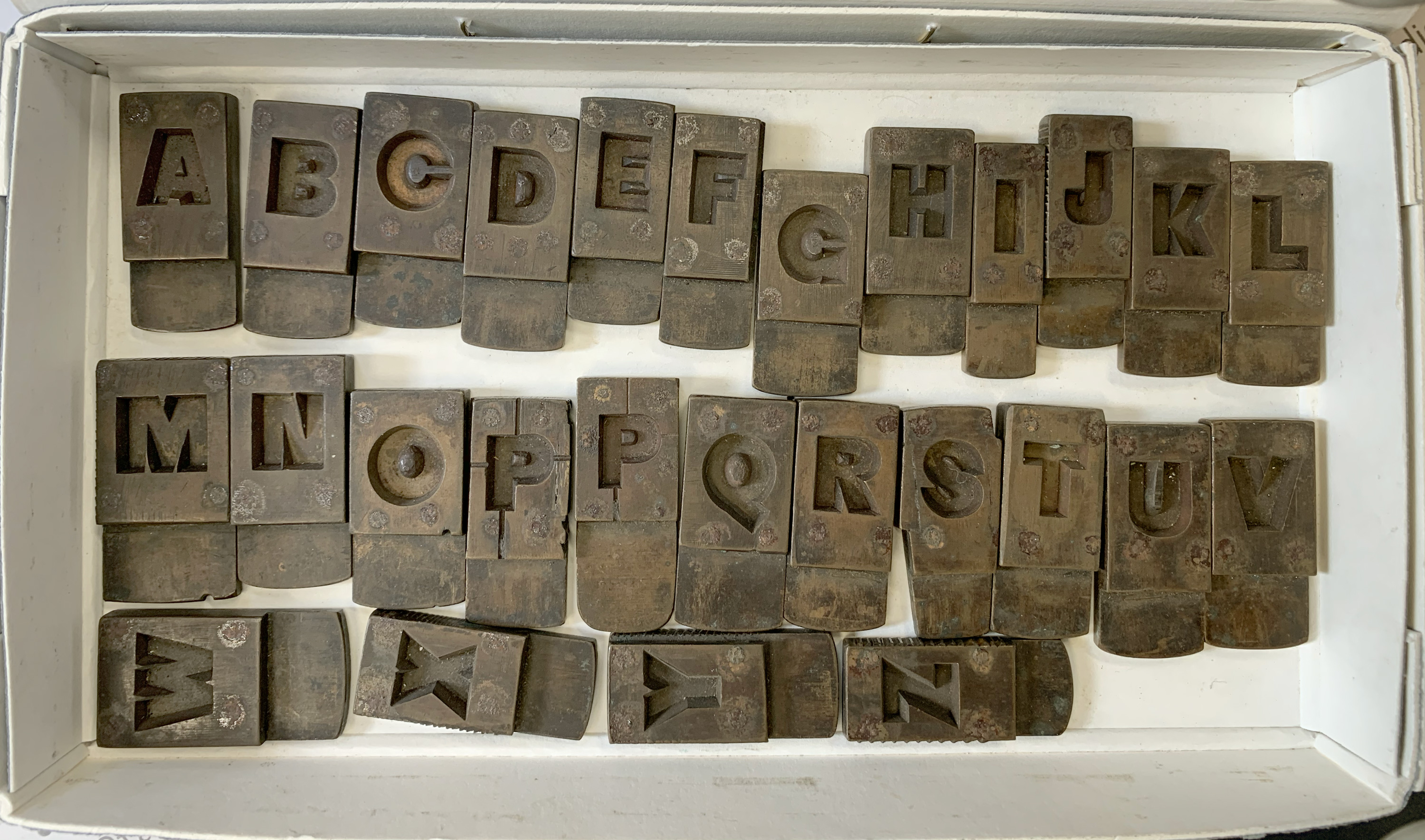
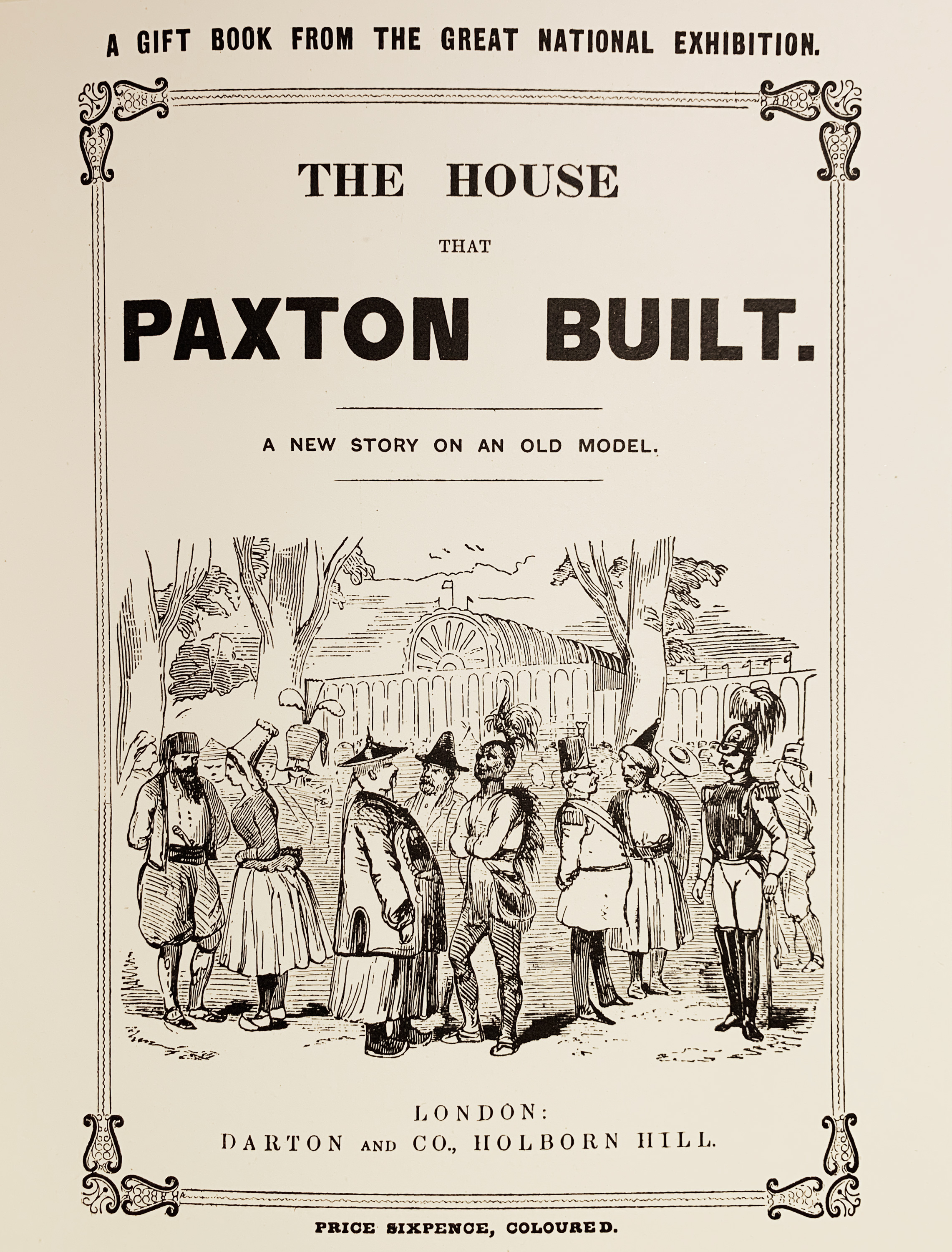
Our logo features a specially-created revival of the earliest complete ‘sans-serif’ font, created by Vincent Figgins’ type foundry in the the mid-nineteenth century. In an era of Victorian flourish and decoration, the sans-serif was an innovation that heralded a new, functional approach for type design, in much the same way that Joseph Paxton’s Crystal Palace was a harbinger of modernism in architecture.
Quick links:
- RGB vector file
- CMYK vector file
- PNG pixel file
Access the current logo library here.
Vincent Figgins
Vincent Figgins was a type founder and philanthropist who lived in the Metropolitan Borough of Camberwell, which extended to what is now Crystal Palace Park. He was buried in Nunhead Cemetery, which now connects with Crystal Palace via the Green Chain Walk. Figgins’ foundry was awarded a medal at the Great Exhibition of 1851 (for which the original Crystal Palace was built), and their Sans Serif was in early use within gift books for the Crystal Palace.
We use our logotype on all the the Trust’s external-facing communications. In order to work well at small sizes or against imagery and textural backgrounds, it was designed to be bold and punchy, simple and functional, without illustrative elements.
Care has been taken with letterspacing and detail, so it should never be redrawn, remastered or altered. (While there are a small number of other digital versions of Figgins Sans Serif, these are less faithful to Figgins’ original designs and are not optimised for our purposes, so should never be used as a substitute.) The colour of the logo can be adapted as needed, using our defined colour palettes.
NB:
- please do not crop or distort the logotype in any way;
- our logo sits freely alongside other content and should not be constrained within a box (which would then effectively become part of the logo);
- our name is ranged left within the logo, which offers a natural point of alignment with supporting text and graphics.
Exclusion zone
It is important that the logo stands out clearly and legibly. The cap height of our name defines an appropriate “exclusion zone”, which is the area that should be kept clear of other content. Avoiding the use of other graphic elements within this area helps reduce visual competition.
The logo may be used against coloured backgrounds, as in the header to this page, utilising our colour palette whenever possible. It may also be used against image backgrounds as long as both the logo and the image are not detrimentally affected.
Always bear in mind the need for contrast between the logo and background.
Versions of the logotype
Different versions are required for different uses and some common variants have been created. The logotype has been created in RGB colours for screen-based implementations and CMYK for printed items. Vector files (.eps, .svg and non-image .pdf) may be scaled for use at any size. Pixel-based file formats (.jpg, .gif, .png, .tif) should not be enlarged or used at more than 100% relative to the file’s size/resolution (see guidance on image use at the end of this document). Bear in mind that automatic conversions of CMYK to RGB, and vice-versa, will not result in the correct colourways and therefore the logo will not match accompanying text or images that use those colourways correctly. See also the separate guidelines on image use.
On screen
Use RGB colourways for screen implementations. Whenever possible use vector files (for screen use, these will usually be in .svg file type), which may be scaled for use at any size. In circumstances when a pixel-based version of the logo is needed, .png or .gif files should generally be preferred to JPEGs for the logo, to ensure accurate colours and crisp rendering.
In print
Use CMYK colourways for print uses. Whenever possible use vector files (for print, these will usually be in .pdf file type, but note that pdfs may contain images, so be careful to check if upscaling), which may be scaled for use at any size. If it is essential to use a pixel-based version of the logotype, only .tif files carry the appropriate CMYK colour information.
NB:
- please do not crop or distort the logotype in any way;
- our logo sits freely alongside other content and should not be constrained within a box (which would then effectively become part of the logo);
- our name is ranged left within the logo, which offers a natural point of alignment with supporting text and graphics.
Exclusion zone
It is important that the logo stands out clearly and legibly. The cap height of our name defines an appropriate “exclusion zone”, which is the area that should be kept clear of other content. Avoiding the use of other graphic elements within this area helps reduce visual competition.
The logo may be used against coloured backgrounds, as in the header to this page, utilising our colour palette whenever possible. It may also be used against image backgrounds as long as both the logo and the image are not detrimentally affected.
Always bear in mind the need for contrast between the logo and background.
Versions of the logotype
Different versions are required for different uses and some common variants have been produced. RGB colourways are to be used for screen-based implementations and CMYK for printed items. Vector files (.eps, .svg and non-image .pdf) may be scaled for use at any size. Pixel-based file formats (.jpg, .gif, .png, .tif) should not be enlarged or used at more than 100% relative to the file’s size/resolution (see guidance on image use at the end of this document). Bear in mind that automatic conversions of CMYK to RGB, and vice-versa, will not result in the correct colourways and therefore the logo will not match accompanying text or images that use those colourways correctly. See also the separate guidelines on image use.
On screen
Use RGB colourways for screen implementations. Whenever possible use vector files (for screen use, these will usually be in .svg file type), which may be scaled for use at any size. In circumstances when a pixel-based version of the logo is needed, .png or .gif files should generally be preferred to JPEGs for the logo, to ensure accurate colours and crisp rendering.
In print
Use CMYK colourways for print uses. Whenever possible use vector files (for print, these will usually be in .pdf file type, but note that pdfs may contain images, so be careful to check if upscaling), which may be scaled for use at any size. If it is essential to use a pixel-based version of the logotype, only .tif files carry the appropriate CMYK colour information.