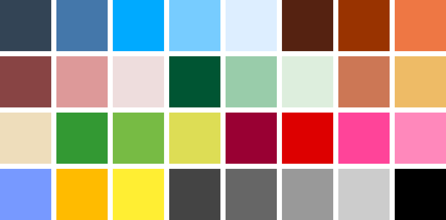
Our communications should be colourful, bright and cheery, but not garish or brash. To aid consistency and speed up decision making, we have a range of palettes to help us adapt and respond to different environments and contexts.
Assets
For screen use: Download CPPT_RGB.ase (Adobe Swatch Exchange), with #HEX/RGB colours specifications.
For print use: Download CPPT_CMYK.ase (CMYK colours specifications).
The .ase (Adobe Swatch Exchange) files contain the full colour palettes to import as colour swatches in Illustrator, Photoshop, InDesign, Affinity Designer & Photo, Procreate, Figma and other applications that support .ase swatches (guidance for using .ase files can be found on ColorSlurp’s website). Do not use applications to convert colours between the screen and print colour spaces.
A positive, vibrant colour palette helps us create visually attractive communications, while hinting at the changing colours of the park. Our logotype may accordingly adopt one of many colours, enabling it to adapt to work with different content, particularly images. We can also use the colour palettes for all manner of supporting graphics, from text to backgrounds, though it is best to aim for ‘colourful, but simple’. Too many colours can result in garishness. White and black can be used as necessary.
Great care should be taken to ensure legibility of all content – see the separate guidelines on the use of text and images, and accessibility.
Consistency of colours within our communications is part of our brand strategy: please do not use arbitrary colours or other palettes.
Colour specifications
Please use the specified colour values for all screen and print implementations. Do not use applications (whether Photoshop, Illustrator, or other) to convert colours from the screen colourspace (HEX) to that of print (CMYK), or vice-versa: applications make such translations differently, frequently inaccurately, and the result will be a loss of consistency across our communications.
Screen-based implementations
For screen-based implementations, use the HEX (hexadecimal) colour specifications. These are in the form of six alphanumeric characters preceded by a hash: e.g. white is #FFFFFF. We always specify paired numbers/letters for our HEX values – e.g. #00AAFF – to make it easier to spot and check whether the correct colour has been specified.
Print-based implementations
For print-based implementations, use CMYK (cyan, magenta, yellow and black) colour specifications. We use simple percentages of those colour combinations to make it easier to spot and check whether the correct colour has been specified.
Pantone™ and RAL colours
We do not use Pantone™ specifications as these are no longer widely included in professional graphics applications, or supported by other office and web applications. For spot-colour implementations (i.e. printing with a single specific, or ‘special’ ink colour), which requires specification as a Pantone™ or RAL colour, please consult your brand representative for further information.
Primary palette
Unsurprisingly, the most common colour used for park identities is green and many park identities consequentially look much the same. Our primary colour is cyan: a bright, positive, celebration of the sky that was virtually part of the fabric of the Crystal Palace when it stood proudly atop Penge Peak on Sydenham Hill, and suggestive of creative thinking and a bright future. In cases where there is no accompanying visual material it is usually best to use the cyan version of our logotype, or a neutral black or white version.

Secondary palette
The ranges of secondary colours are based on specific park assets. They are part of what makes us unique and our communications should generally be based around these colours. They do not have to be used in a literal fashion – e.g. only for the assets that the colours represent – though sometimes that may be appropriate, such as in notices. Feel free to select colours from across the range to re-combine in an apposite, controlled manner.


Tertiary palette
Tertiary colours are useful for supporting graphic elements, e.g. rules, borders and graphs, or as ‘accent’ colours to combine with the primary or secondary palettes. The brighter colours should be used sparingly.
- Where the primary colour is inappropriate, e.g. for legibility against other backgrounds, one of the other blue sky colours may be preferred.
- The greys are useful for text and other graphic elements such as rules and borders that are there to punctuate rather than accentuate.
- The wildflower colours should be used sparingly, e.g. to complement other colours.


Examples
The examples below show two social media banners using colourways associated with the asset mentioned…

… whereas, the examples below use colourways selected for thematic relevance.

Sub-brands
Note that different sub-brands have their own colour palettes, based on the generic colours listed above.


